2007/05/21
icff 2007: part one
Do you like this story?
 my feet are sore and my voice is just about gone, which means it's design season in nyc! this past weekend i took my first shot at covering icff, the stationery show and surtex. over the next 5 days i'll be posting highlights from all three shows. today will be all about icff, but if you'd like to skip the text and go straight to the (full-sized) images you can click here for a slideshow of icff part 1 images.
icff didn't really knock me over this year, but there were some stand out pieces. i felt like something about the show just didn't "pop" this year like it normally does. a lot of booths were using acrylic again (bent acrylic chairs, curved acrylic tables or side chairs) and more than i can count were using bent ply and walnut veneer. that's not to say that any of those materials are inherently bad, but they do tend to get used in a fairly predictable manner. hopefully haute green or next year's icff will show designers using these materials in a more inventive way. enough with the down side- let's get to the good part: highlights! the show provided more than enough product design for two posts so today will be my absolute favorites....


as always, karen combs at nama rococo produced some of the most beautiful pieces at the show. she debuted a fantastic new hot pink (and i mean HOT PINK) wallpaper design with beautiful droplets of green mixed in. it was a great expansion on the current collection and further proof that nama rococo is a company to watch.


we talked about catherine hammerton last year so i was thrilled to see her exhibiting again amongst her british colleagues. this year she debuted the stunning pick wall art above, made from paper that's been sewn and burnt in spots to create the wall hanging you see above. catherine also showed her lovely gingko paper seen above in black- she's always playing with texture and paper in such inventive ways.


this next booth was without a doubt one of my favorites of the show. risd teamed up with swarovski to create a collection inspired by the company's crystals. the "extruded swarovski" chair above (featured in three photos) by maria gmuca was my favorite piece of the show hands down. i wanted to EAT this chair i loved it so much. the big, chunky crystals up against the smooth chair with all of its different ridges was absolutely stunning to behold. sure, it's not the most practical piece, but the pixelated nature of the chair combined with those huge chunks of crystal was just too beautiful to ignore. i could go on and on about this piece but i'll save you my blithering and mention that i'll be going into more depth about this booth later this week.

wallpaper was definitely one of the categories that did well at this year's show and david roos' work was no exception. the british designer's collection reminded me of nama rococo, but with a more sophisticated twist. the green pattern to the left was particularly stunning in person.

i remember seeing chandeliers like this in anthropologie years ago, but the concept still makes me happy. designer ali siahvoshi's "hungry" sconce was a simple but beautiful piece of lighting. shiny, symmetrical and just begging to be used in the kitchen...


the boys of mio introduced another beautiful cardboard system this year. "nomad" is made from recycled, double wall cardboard and can be assembled without hardware or tools. my camera didn't capture the color well, though- the greens are much more vibrant in person.

these colorful timber stools from fleetwood were everyone's favorite. these friendly little stools came in a wide range of colors and can be used as stools or occasional tables.

every year the eames booth does something fun with one of the lounge chairs- this year they cast it from solid steel comissioned artist cheryl ekstrom to sculpt a limited edition piece from staineless steel. that's right- not metallic fabric, but solid metal. better for looking than sitting...


these beautiful lights were at the juju booth (more on them later this week). the pattern was screenprinted onto the clay for a subtle bit of pattern.


also part of the juju booth, these little "lovelies" were actually magnetic ceramic salt and pepper shakers.


the brits were really on top of their game this year- i really enjoyed almost all of their booths on the right side of the show. designer louise body showed some beautiful screened pillows, bolsters and wallpaper- each lovelier than the next (her website is FULL of images so be sure to check it out. i'm sure we'll be seeing lots of her on blogs this week).


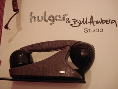
hulger had a fun booth (manned by a super cutie) with all sorts of new "old" phones that plug right into your cell. these hand-written and lizard skin (i believe it's faux) styles were my favorite.

it goes without saying really that deborah bowness' booth was be-autiful.


amenity home showed some really fantastic baby linens this year. i loved the retro meets modern vibe and the new color palette. they made sure that this new series still blended well with the existing "adult" line, which was a nice touch.


carly and ophir at cavern home showed some great new patterns- they were hard to get a good picture of (my camera has trouble with the lighting at icff sometimes) but i'm sure i can grab some professional shots soon...


i noticed a lot of great design for kids this year. one of my favorites was from newcomer boodalee. there was a fun retro vibe to their work, too and i loved the way the patterns reminded me of wooden building blocks.

of course i can't find the card for this piece right now but i'll update it soon. this was a beautiful black version of the cocoon lamp i wrote about last year at icff. i'm running out the door to cover more of the stationery show today so i'll find the details for this tonight.

i LOVED these new colorful tabletop lamps from pablo. so much more manageable and fun than the original size in my opinion.


last but definitely not least was a wonderful new booth full of south african designers. amaridian was a collection of pieces from african designers- ranging from beautiful red beetle shelving to lush chandeliers in red, black and white. i'll have more from them later this week. for now i'm off to the stationery show...

This post was written by: beemagnet77
BeeMagnet is a professional graphic designer, web designer and business man with really strong passion that specializes in marketing strategy. Usually hangs out in Twitter has recently launched a blog dedicated to home design inspiration for designers, bride, photographers and artists called HomeBase


0 Responses to “icff 2007: part one”
Post a Comment